
Nobody likes to do the same thing repeatedly unless it’s about having your favorite meal or listening to your favorite song on a loop, right?
Businesses do realize that, too. This is why most create FAQs (Frequently Asked Questions) on their website to avoid manually answering common and repetitive questions.
This page consists of questions commonly asked by customers about product or service usage, business hours, prices, refund policies, and more.
According to a Forrester study, 60% of customers have used FAQs or help pages on a company’s website in the past year.
In this blog, we will cover the basics of an FAQ page and reveal 25 FAQ page examples to help you become a pro at not answering the same questions again! Sounds good? Let’s go!
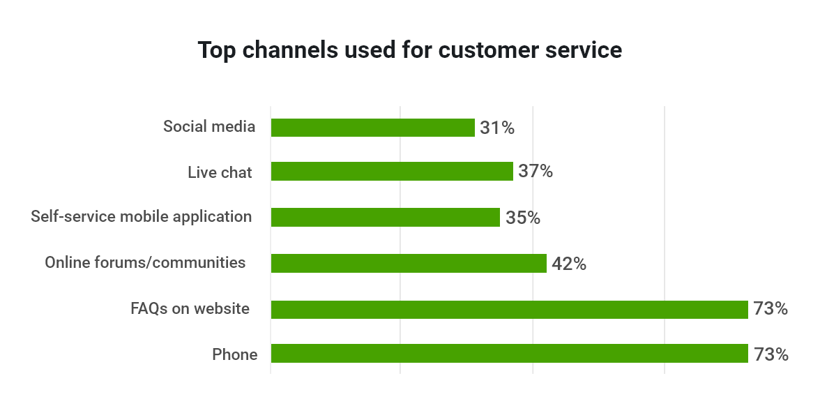
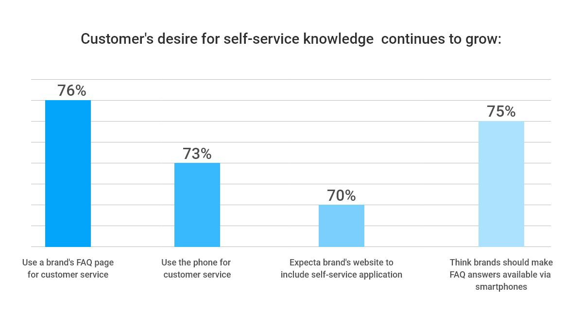
The following image shows the significance of FAQs as one of the top channels for customer service.
What Is an FAQ Page?
An FAQ page serves as a one-stop shop for customers to find answers to their most common queries, catering to users at every stage of their journey. Each FAQ begins with a question and provides a brief solution.
Within a knowledge base, FAQs can either stand alone as individual articles (for example, “How do I set up a password?”) or be woven into a broader narrative (such as “Getting started with your account”).
However, the significance of creating FAQ pages extends beyond just a help center. Chatbots can also utilize them to offer real-time support, making them an invaluable tool in the customer service arsenal.
Read More: Best FAQ Software & Tools
25 Best FAQ Page Examples
Imagine enabling your customers to find answers faster than you can say, “How may I assist you today?” Fascinating, right?
That’s what the following companies have done – these FAQ examples will inspire you to step up your customer support game.
1. Zappos
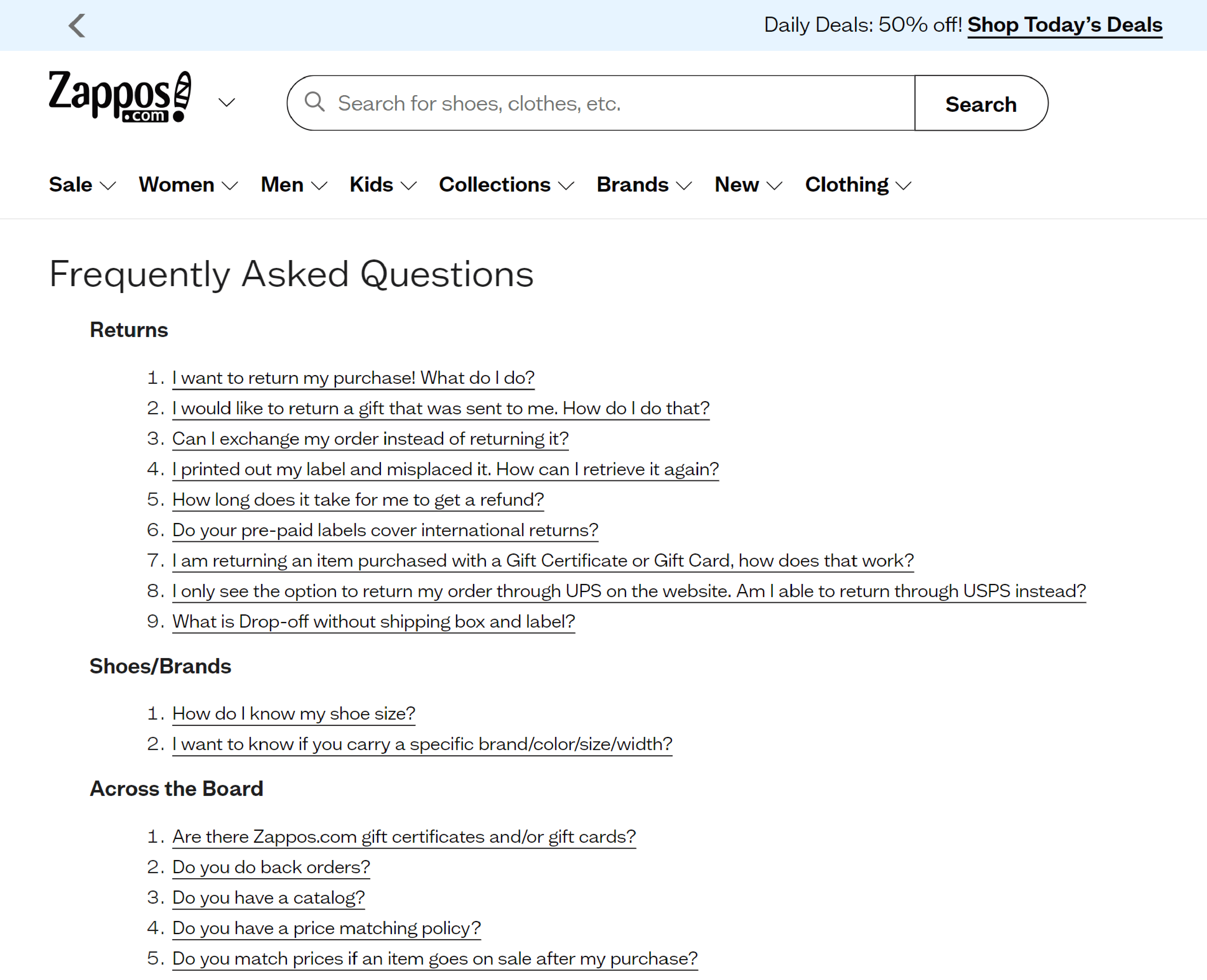
Zappos has a comprehensive FAQ section with broad categories comprising multiple questions.
There is no search bar on its FAQ page. But it still offers visitors a seamless experience, thanks to its meticulously arranged FAQs on a single page.
2. Etsy
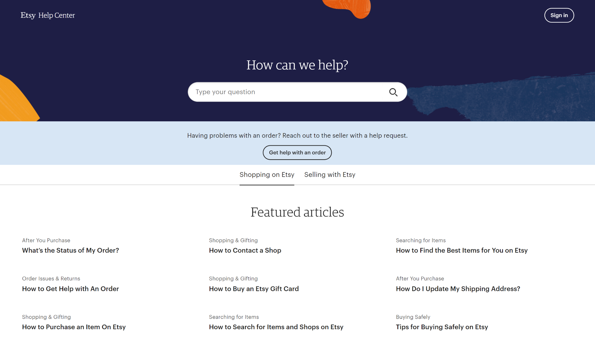
The best part about Etsy’s FAQ section is its clear-cut and straightforward categorization. Popular articles are mentioned right at the top.
Click on any of them, and you will be directed to a page where you will find other articles related to that topic on the left-hand side.
An easy-breezy search experience indeed!
3. WhatsApp – FAQ Page Example
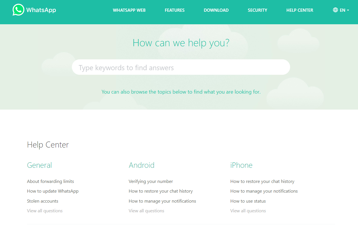
The key highlight of WhatsApp’s FAQ section is its comforting color scheme that matches its branding.
A search bar at the top of the page, simplicity of design, and large, prominent categories make this FAQ page one of the best.
Each category (General, Android, iPhone, etc.) has three to four major topics; the rest are mentioned in the ‘View all questions’ button.
4. Starbucks – FAQ Page Example
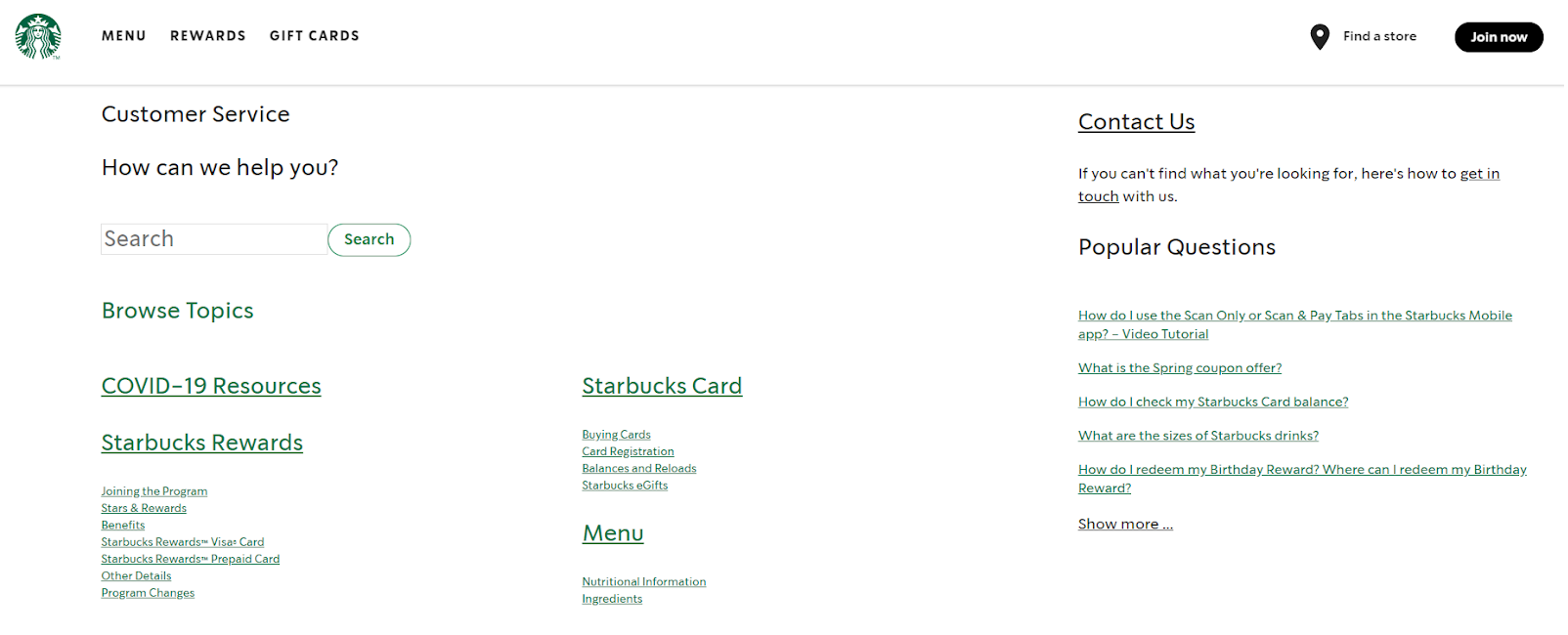
Starbucks’ well-crafted FAQ section deserves a round of applause. Its color scheme aligns with its branding, although anyone would feel the company can experiment with shades of green. That would enhance its look even more.
Articles are divided into broad categories, and one interesting aspect is the link to the contact details mentioned at the rightmost corner.
If customers have questions that fall beyond the range of this FAQ page, they can quickly reach out to an agent.
A good strategy, right?
5. Nike – FAQ Page Example
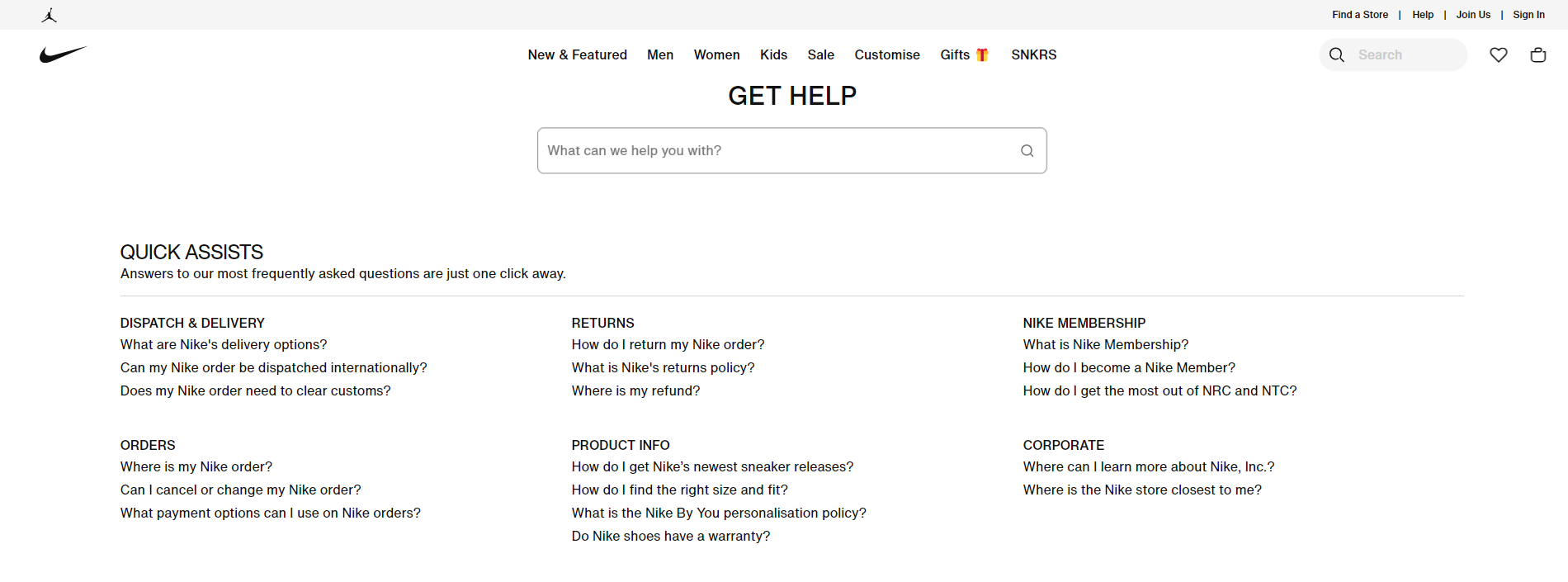
Nike has kept its FAQ page simple and fuss-free. No bright colors or unnecessary design elements. Just plain, black-and-white content and topics arranged together in broad sections. Minimalism at its best!
The highlight of its FAQ page is the ‘Contact Us’ section. This part has different contact options – call, chat, and email for other categories.
If a renowned brand like Nike leaves no chance to help customers, why should you?
6. Bank of America
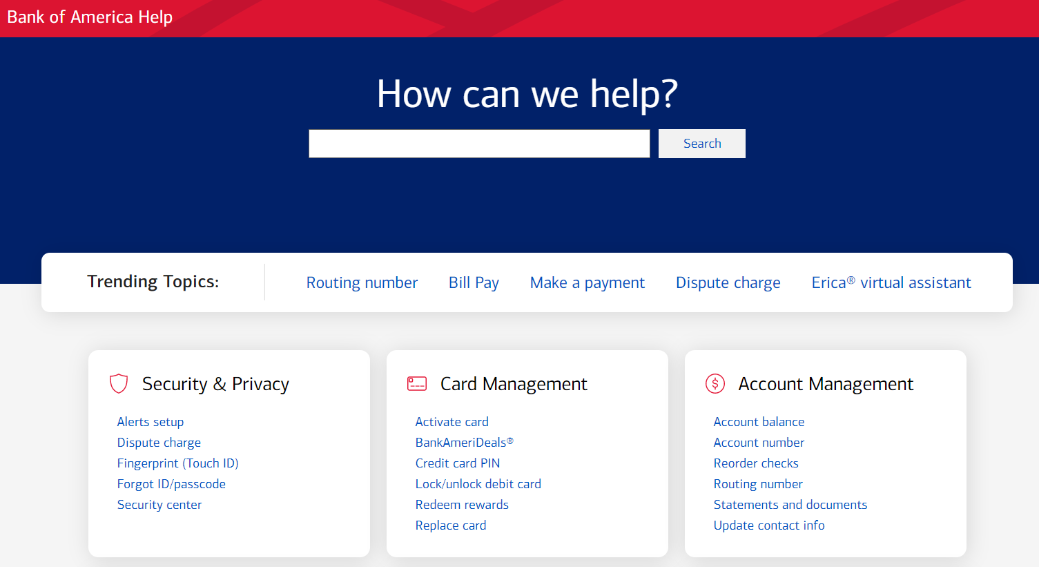
Bank of America’s well-maintained, aesthetically appealing FAQ section deserves your attention. Its color scheme is in perfect sync with its branding.
There is a search bar where you can type questions or browse its question list.
Notice the categories mentioned on its FAQ page (Security & Privacy, Card Management, Account Management, etc.); you will agree that they cover almost all relevant topics.
Besides, you can find additional help sections in the right-hand column that allow you to perform actions like overcoming financial troubles, reporting suspicious emails, and more.
7. AirBnB
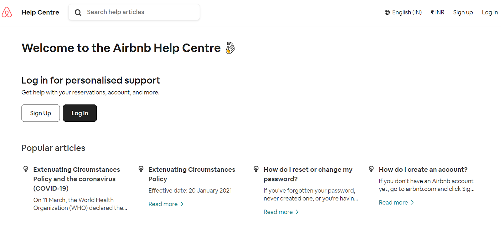
AirBnB’s sweet and simple FAQ page will catch every visitor’s attention. It has a stack of popular articles right at the very beginning, making it easy for customers to get the help they need quickly.
Scroll down, and you will find different help categories – booking and traveling, hosting stays, company travel, and hosting stays.
Select an option, and you will find various sub-topics relevant to that category.
What’s inspiring about this FAQ page is the ‘Give us feedback’ section at the end of the page. This indicates AirBnB’s inclination to provide better and improved support services.
8. Macy’s
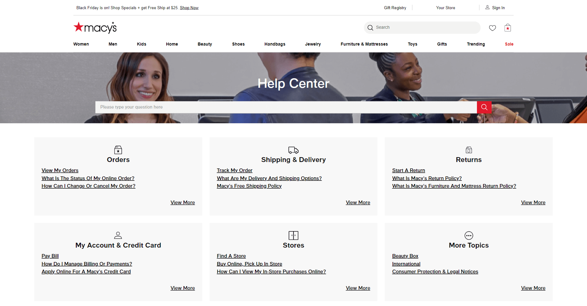
Macy’s FAQ page is impressive and searchable, clean, and specific. It is created and designed with simplicity and compelling clarity. The answers to all the questions are precise and to the point.
You won’t get overwhelmed looking at its FAQ page, as the section contains limited but essential questions commonly raised by customers. Hover on each category, and you will find crucial questions right there. Click ‘See all’ to see the entire contents of each section.
9. Shopify
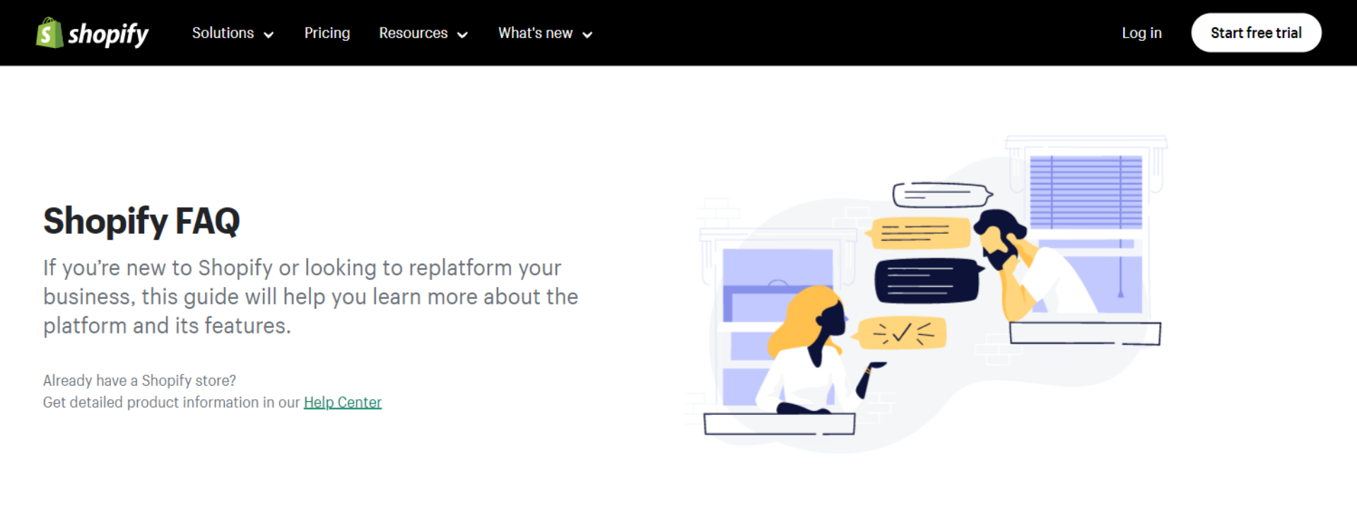
A search bar is essential for lengthy FAQ sections. Something like Shopify’s FAQs with a limited number of questions can work well even without a search bar.
As you can see, four broad categories are on the left-hand side. Click on anyone, and you will find all relevant topics on the right side of the screen.
The best part? After every question and answer, you will find a feedback question – Did this answer your question, with Yes/No as the answer options?
10. Samsung
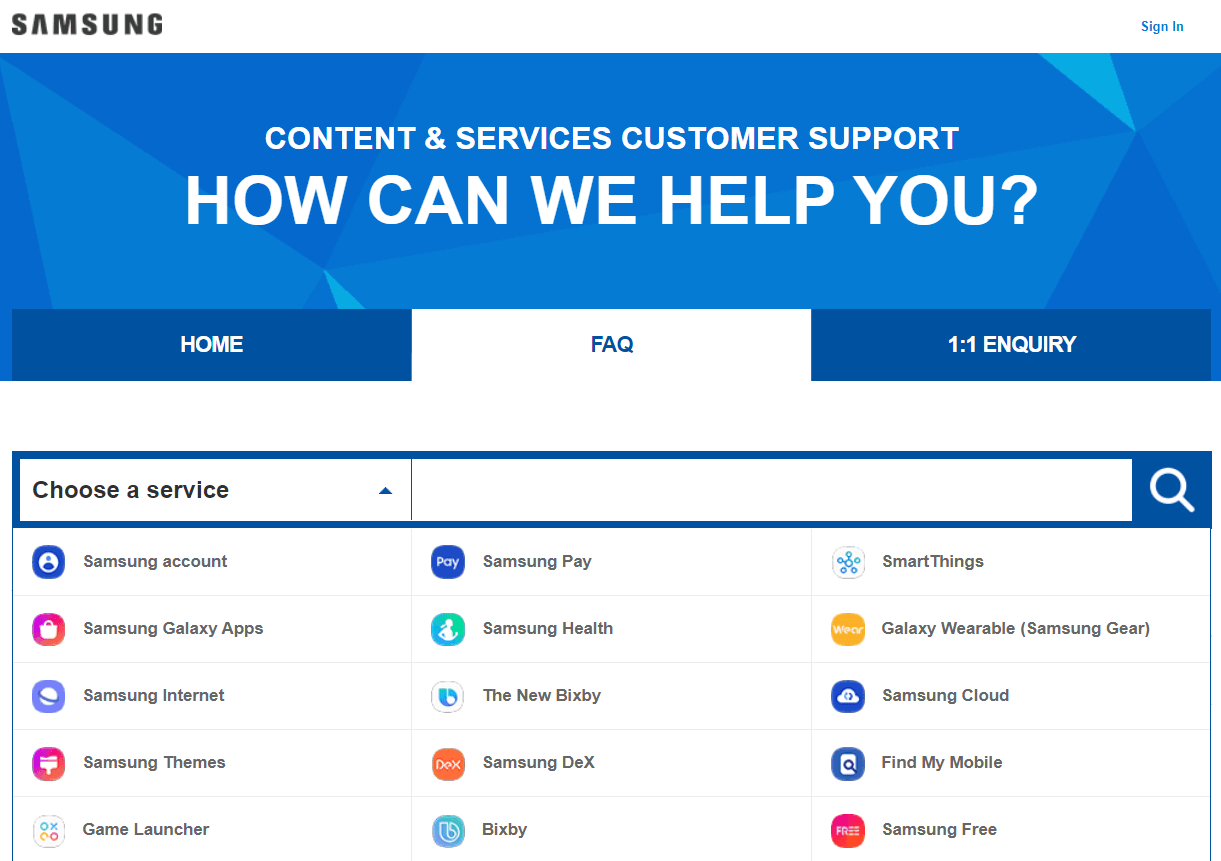
This is another excellent FAQ example you can take a cue from. Some elements of Samsung’s FAQs are applause-worthy. Its color scheme goes well with its branding. The FAQ section is comprehensive and easy to follow.
You can first choose a service – Samsung Pay, Samsung Account, Samsung Internet, or any other. Once you do that, you will find relevant questions and their answers.
A feedback question follows each answer – “Is this information helpful?” with a rating scale and a comment box to leave your comments.
11. Twitter
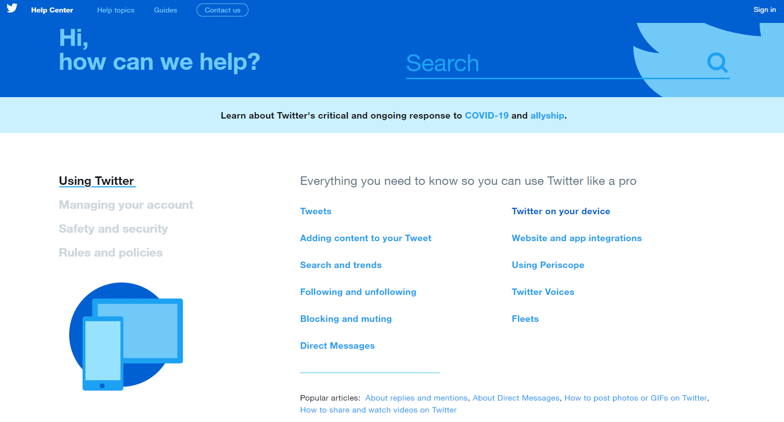
Twitter’s elegant FAQ section can win anyone’s heart. It’s abundant in information and perfect in aesthetics. A killer combination of looks and knowledge, this FAQ example can teach you a lot about what makes an ideal FAQ.
Beautifully aligned with the brand and meticulously curated, Twitter’s FAQ page offers a seamless experience to all new and existing users.
The highlight is the ‘Get more out of Twitter’ section, offering pro tips, guides, and rules to help visitors make the most of this social media platform.
12. Walmart
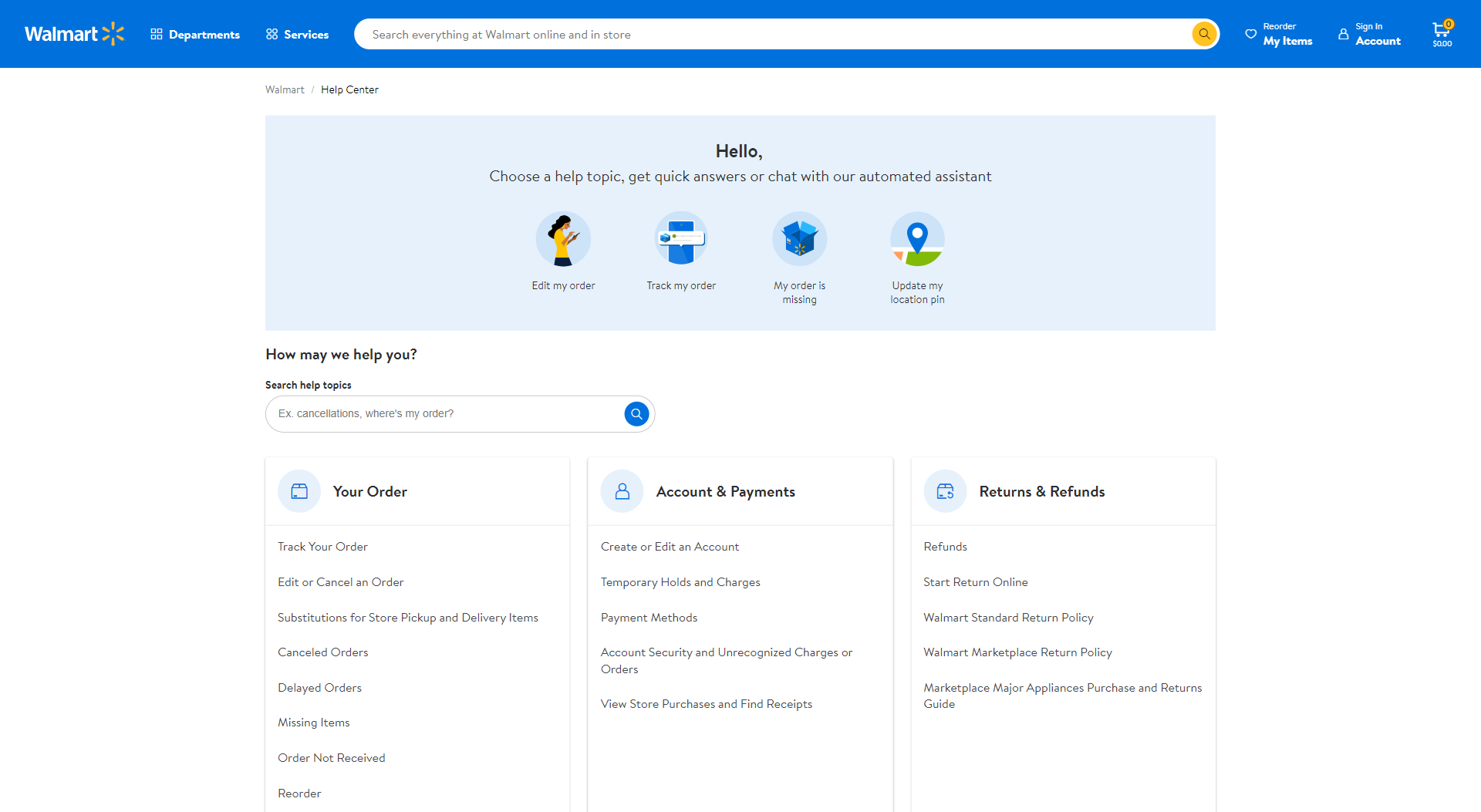
Walmart’s exhaustive FAQ section provides all the information customers need before, during, and after purchasing.
It has a visible search bar at the top and three major topics below. Besides FAQs, this page comprises various other help topics related to Walmart accounts, shipping, gift cards, store support, and more.
One of the key elements of Walmart’s FAQ page is that it allows customers to chat with a representative in case their questions aren’t resolved.
13. Sephora
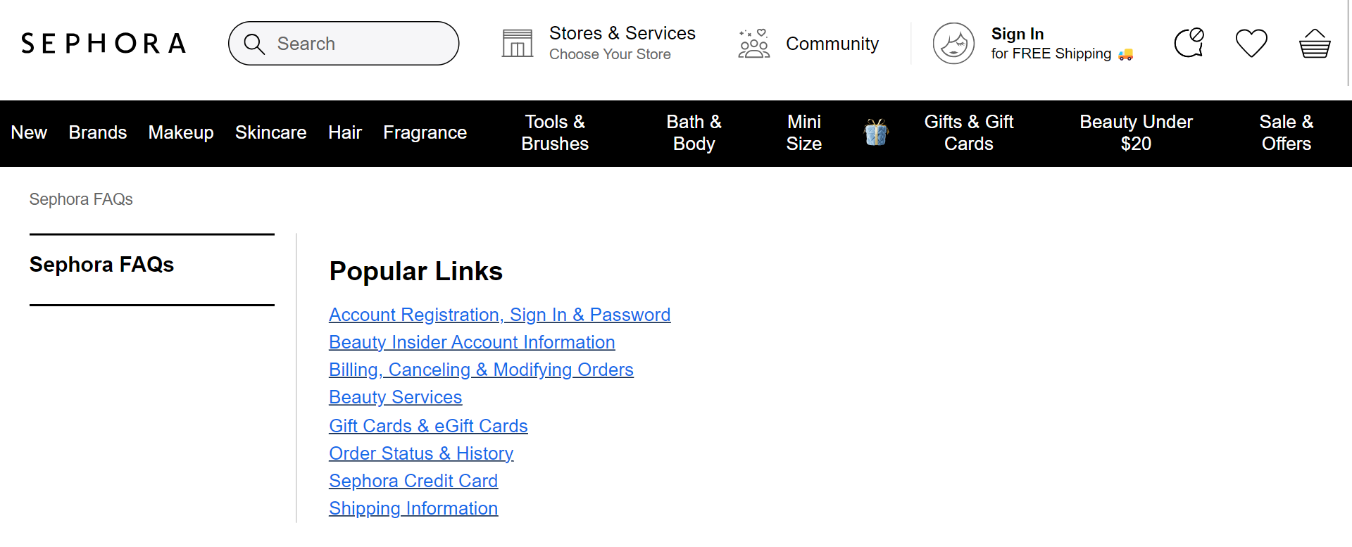
Sephora offers one of the best FAQ examples. It’s simple, clean, and comprehensive – all at once. Its FAQ section displays only a few major categories.
Once you click on each, you will find various subcategories and many helpful articles on essential topics. Dig deeper into this section, and you will notice that multiple answers are linked to other relevant help topics.
The FAQ section is highly detailed and specific, ensuring every customer leaves the site satisfied.
Sephora’s FAQ page is excellent in all aspects except one – searchability. If it had a search bar, it would have given this FAQ page the much-needed boost.
14. Netflix
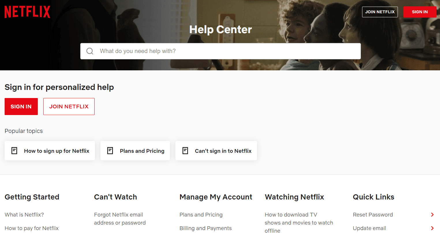
Netflix’s help center is a perfect FAQ example. It’s all-inclusive, detailed, and provides everything visitors might want to know about using Netflix successfully. Its search bar is embossed right at the center, where customers can find anything they want.
The best part is that popular articles are displayed at the very beginning, making it easy for visitors to find answers at the drop of a hat.
15. HighQ
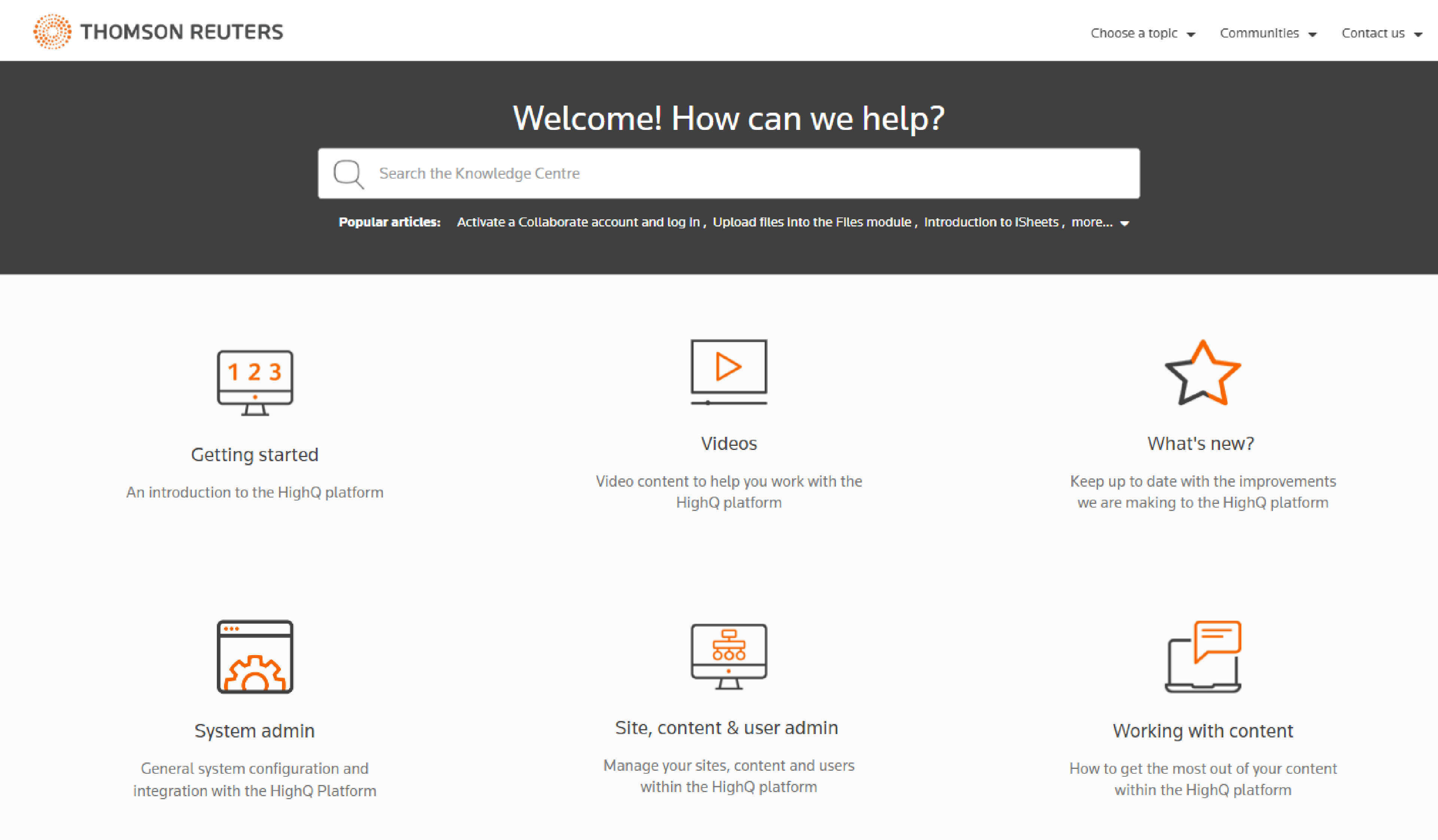
HighQ offers a seamless user experience through its clear, easy-to-follow help center. It has a bold search bar that helps customers get the right help articles within seconds. Its home page looks neat and clean, with broad categories mentioned.
Click on any of these, and you will find options to filter information by product or product area. Besides, after every article, you will find the question – Was this article helpful, with Yes/No as the answer options?
Customers can quickly submit their suggestions in the comment box if unsatisfied.
A great way to know if the help articles help customers!
16. ActiveCampaign
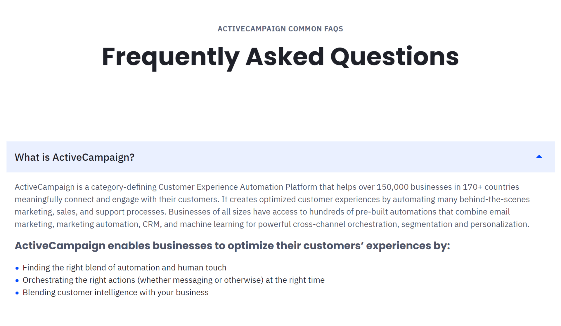
ActiveCampaign’s FAQ page is designed to focus on simplicity. It features a straightforward layout, presenting a list of frequently asked questions.
Each question, when selected, expands to reveal a concise and direct answer.
This design ensures customers find solutions quickly and efficiently without navigating multiple pages. The entire FAQ content is conveniently organized on a single page for easy access.
17. Whatfix
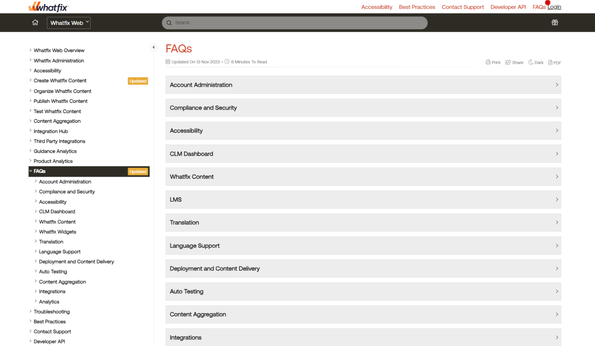
The FAQ page of Whatfix is designed for an incredibly intuitive user experience. Questions are neatly organized into categories, each with a sleek dropdown menu.
Users can view all questions within a category on a separate page by clicking on the relevant link, where detailed answers are provided.
Additionally, a search bar is conveniently located at the top of the page, enabling users to quickly find the specific information they need.
18. Dropbox
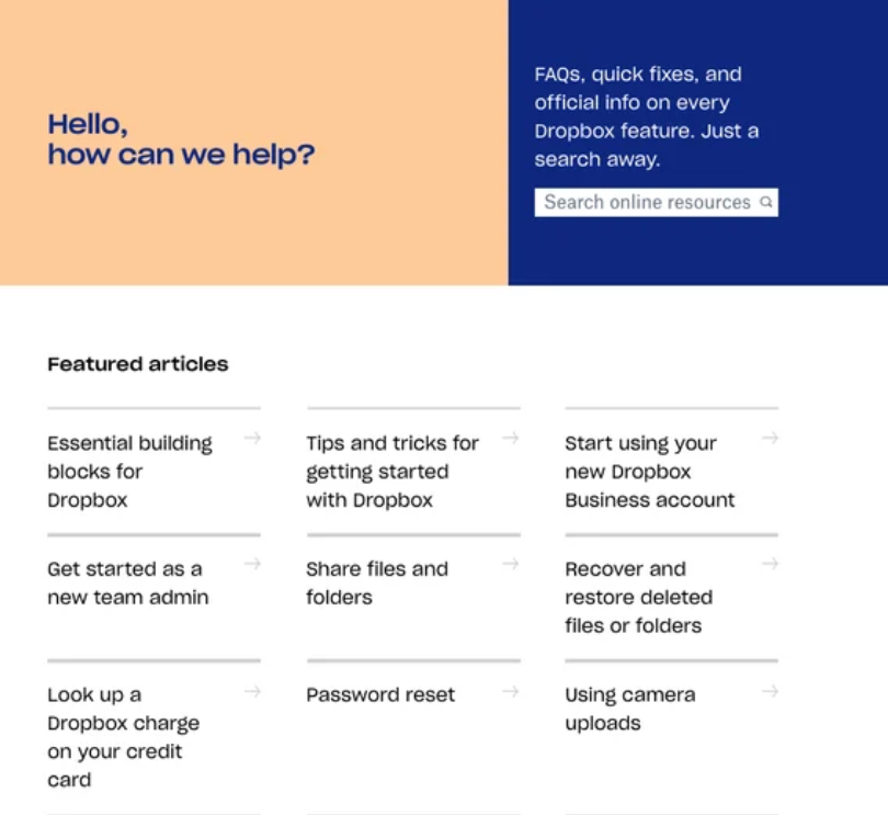
Dropbox’s FAQ page is comprehensive and uncomplicated, ticking all the right boxes. It features a prominent, bold search box, encouraging visitors to use this feature to access their queries rather than scrolling through the page quickly.
The top section of the page showcases links to featured FAQ pages, which are likely the most popular or recent ones. Furthermore, various topics are presented below with brief descriptions, enabling readers to access the necessary answers swiftly.
19. Adobe Creative Cloud
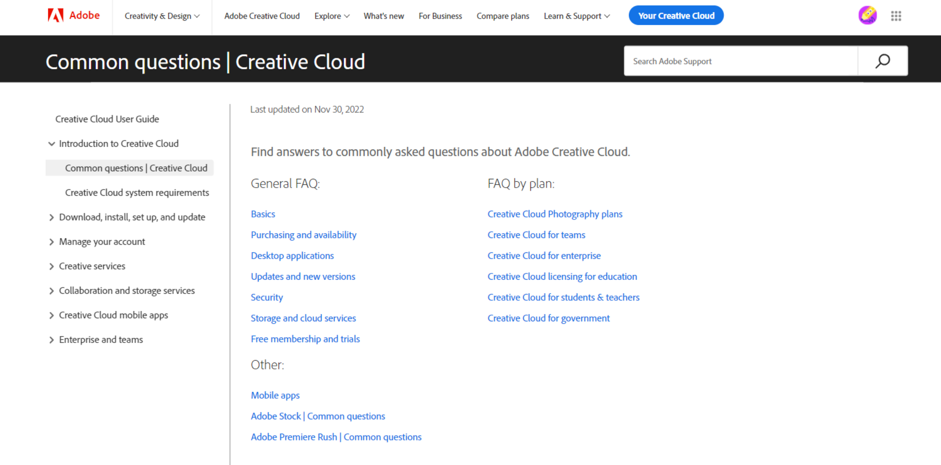
The FAQ page of Adobe Creative Cloud is designed for user convenience. It features a search bar at the top for quick access to queries and a disclaimer indicating that the content applies to the 2018 version of Creative Cloud.
What sets this page apart is its seamless navigation – no need to navigate away from the original page. All topics are linked at the top within broader sections. Scrolling down, you can view each topic question and click on the arrow to reveal the answer.
20. Wikipedia
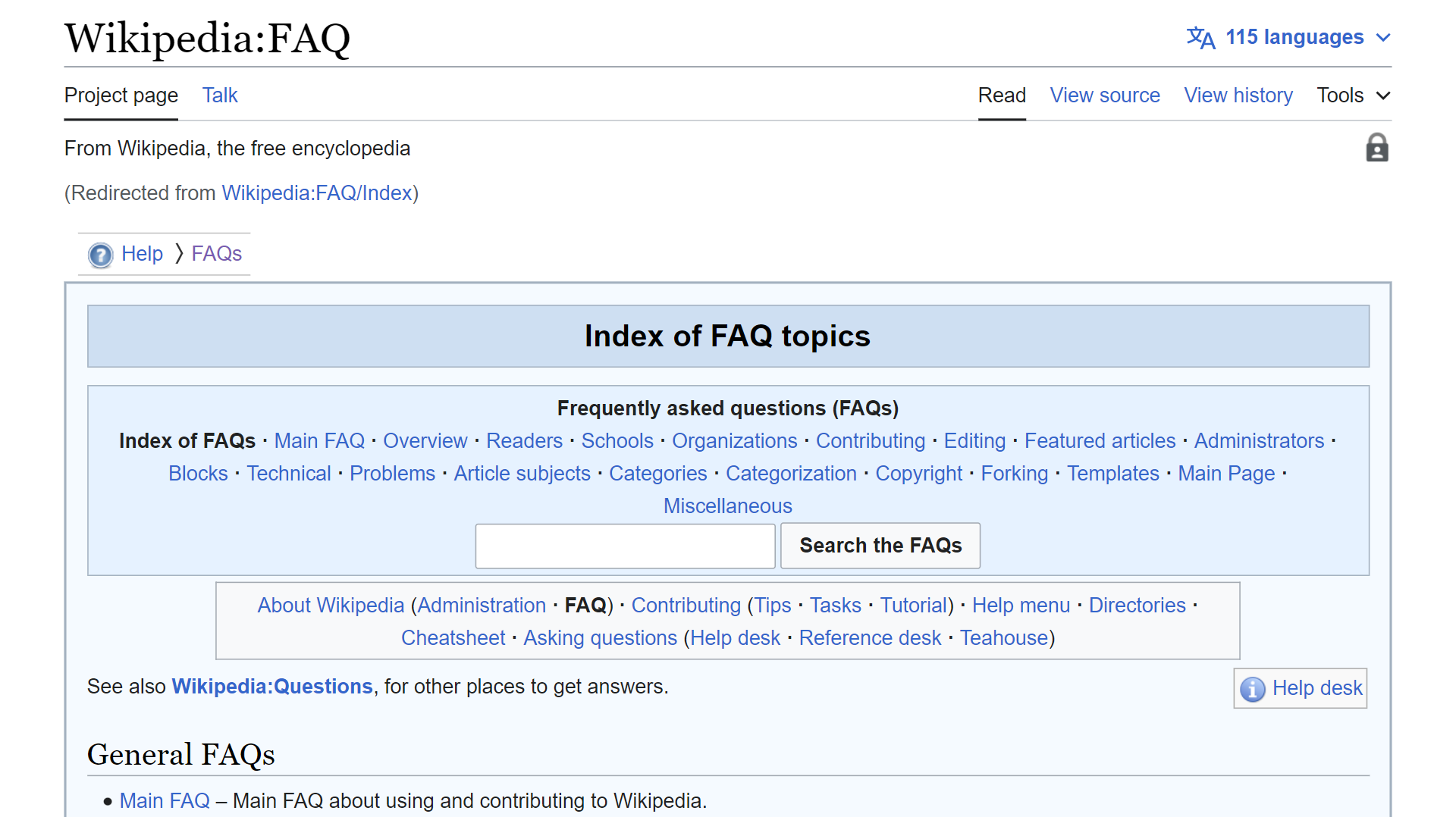
Wikipedia’s FAQ index is designed to mirror the format of its articles. At the top, you can search through all the FAQs or explore broad topics categorized under “General” and “Specific.”
Each topic redirects you to a separate page listing all related questions and corresponding answers. This layout provides a familiar and efficient navigation experience for users.
21. Microsoft
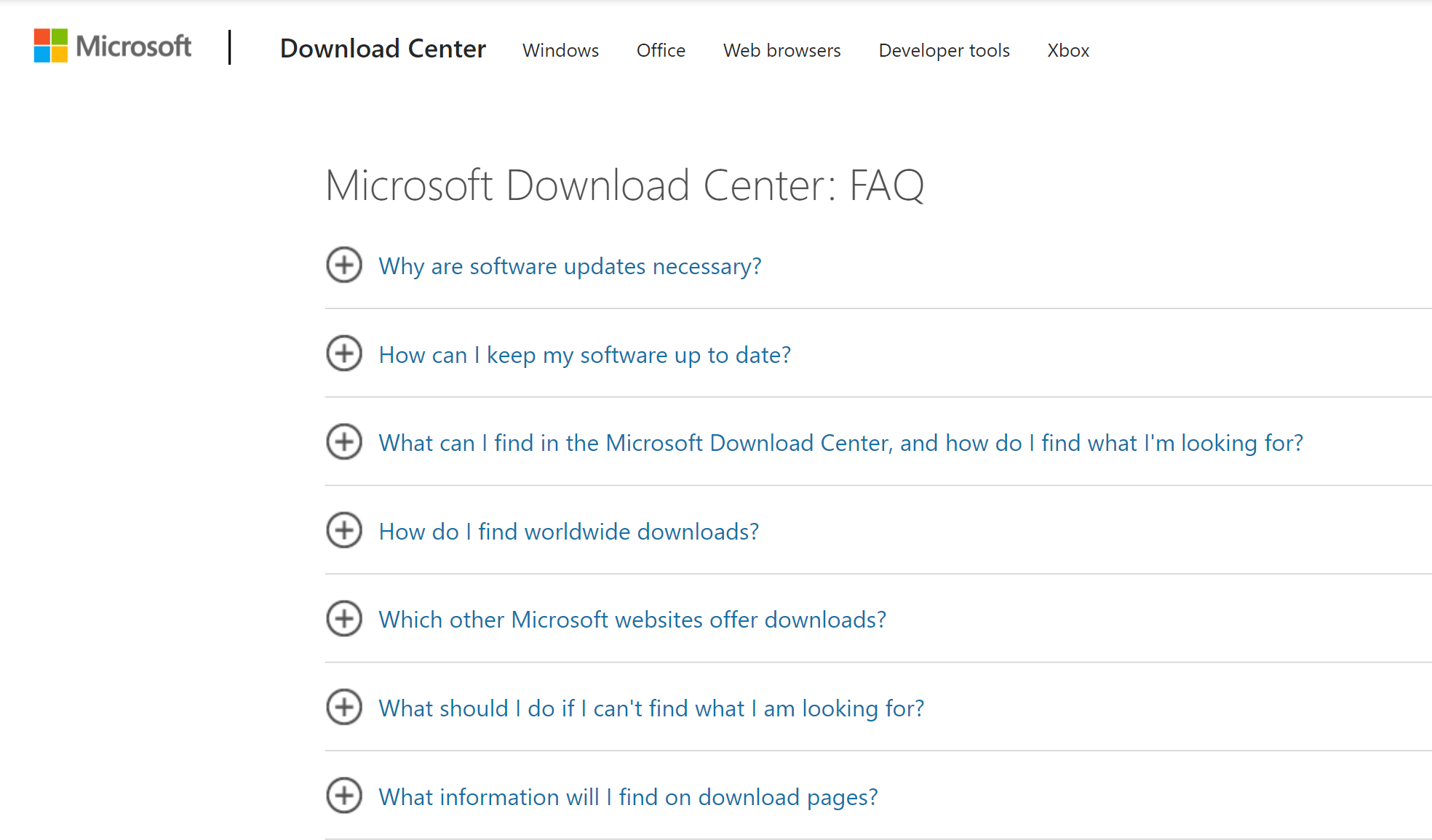
Microsoft’s FAQ page stands out with its minimalistic design. The Download Center page displays different toggle content links with plus signs next to them. Clicking on these questions presents an explanation of the topic.
With all the possible questions a user may have, Microsoft has listed the questions and answers for each category, eliminating the need for a search bar.
This approach makes finding what you’re looking for easy without getting overwhelmed.
22. souk + SEPIA
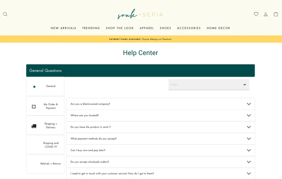
The FAQ page of souk + SEPIA features a directory to categorize customers’ questions. It has dedicated an entire category to address concerns about shipping delays due to the pandemic – information that can build customer trust before purchasing.
This shows that souk + SEPIA is responsive and attentive to customers’ needs and concerns.
23. Ahrefs
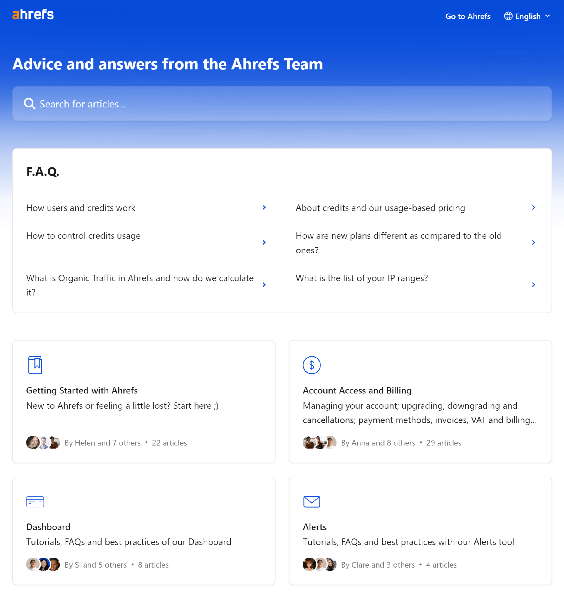
Ahrefs FAQ page is neatly organized into sections like “Getting Started” for basic queries, “Account Access and Billing” for subscription and account-related questions, and dedicated sections for core features like Ahrefs Dashboard, Content Explorer, Keyword Explorer, Rank Tracker, Site Audit, and more.
This comprehensive resource empowers users to find answers independently while also serving as a repository of how-to articles that help Ahrefs capture long-tail keywords from search engine users.
24. Magic Spoon
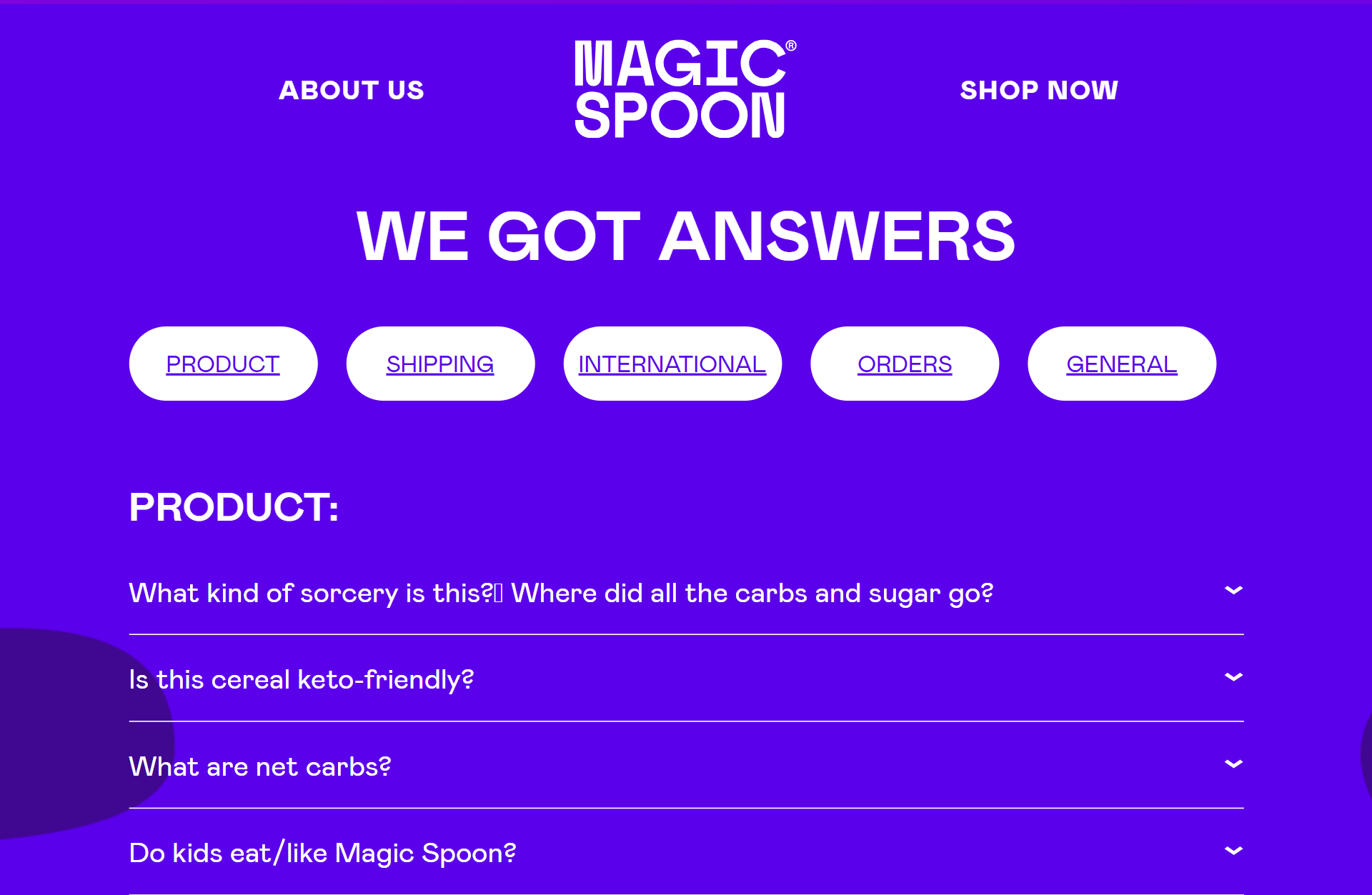
Magic Spoon’s FAQ page is easy to navigate, with questions organized into categories under their “We Got Answers” header. They bring fun and humor to their concise answers, making the user experience enjoyable.
This playful approach aligns with their brand identity and makes their FAQ page informative and entertaining
25. G2
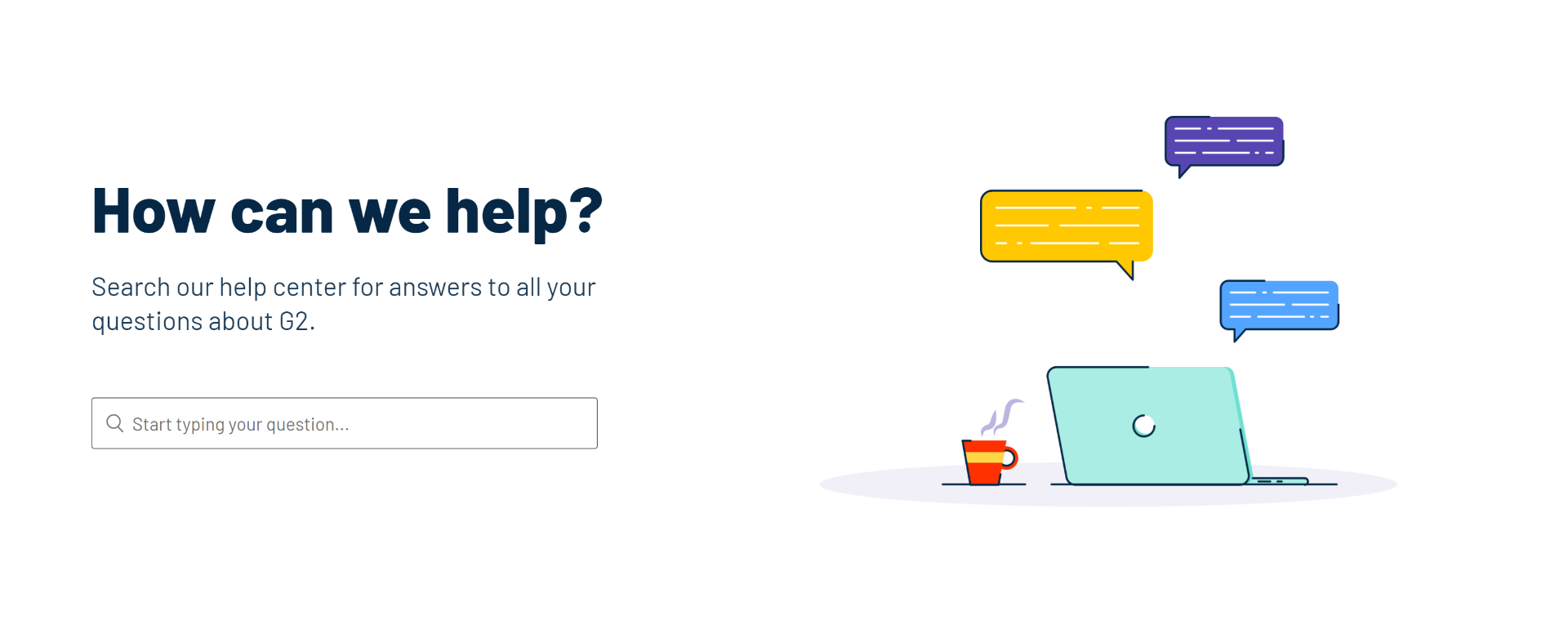
G2’s FAQ page is searchable and divided into various sections, including “reviews,” “gift cards,” “accounts,” “trust,” and “other” to help you find the exact answer they’re looking for.
This comprehensive approach ensures that all users, regardless of their role or query, can find the information they need quickly and easily.
To have insights into creating an FAQ page as a part of a knowledge base, watch this insightful video:
What Is the Purpose of FAQ Pages?
The FAQ page is the underrated customer support hero. It’s like having a mini customer service rep right at your fingertips, ready to answer your burning questions 24/7. And the best part? It doesn’t need coffee breaks!
An FAQ page is crafted for:
- Enabling a self-service tool – providing answers to common questions, reducing the need for customers to contact support for every small query
- Saving time for both the customer and the support team by addressing common questions and concerns
- Building trust by demonstrating transparency and a willingness to address customer concerns
- Improving site navigation by guiding users to different parts of your website based on their queries
- SEO benefits by adding well-optimized, relevant keywords to improve your website’s search engine ranking.
Benefits of Having an FAQ Page
FAQs are more than just repositories of answers – they’re the secret sauce that can transform your customer support game and keep your clients returning for more. These are the commonly reaped benefits of FAQs:
1. Keeps the Revenue Rolling
An FAQ section forms an essential part of the conversion funnel. It gives customers an uninterrupted problem-solving experience. Regardless of their kind and number of challenges, they can always rely on FAQs for accurate and timely help.
A good issue-resolution experience points them to the right places on your website and urges them to buy your products or subscribe to your services.
2. Keeps Ticket Volume in Control
What can be better than giving customers an information-rich platform where they can address their primary concerns? It saves them a lot of time and keeps your support ticket volume in control.
When ticket volume drops, agents are better positioned to focus their time and energy on pressing customer issues.
3. Builds and Retains Trust
Information is everywhere. Type something on Google, and you will find ten answers. But are all these answers reliable?
Not really. That’s why customers are skeptical about the information they receive from online sources. They search intensively, check reviews, customer ratings, and much more before purchasing or trying out a feature.
Understanding customers’ pain points and providing accurate and updated information in your FAQs makes their work easy and fuss-free. They start seeing you as a trustworthy brand offering quality products and timely help.
4. Boosts Website SEO
Believe it or not, FAQs can bring massive traffic to your website. If your FAQs are comprehensive, keyword-rich, and well-connected to the rest of the website content, Google can crawl them and present them on top search results.
A search engine-optimized FAQ section can attract shoppers to your website and convert them into paying customers.
Read More: The Ultimate Knowledge Base SEO Guide for 2020
Note: You will only derive these benefits after a while – only after you put consistent efforts into maintaining the relevance, accuracy, and quality of your FAQs will you find them working for your business.
Design the Best FAQ Page to Offer the Right Answers at the Right Time!
The above FAQ page examples of business giants like Starbucks, Bank of America, and Netflix give a solid idea of what great FAQs look like.
A well-structured FAQ page can significantly enhance your website’s traffic, improve customer service, and streamline the user experience. Therefore, creating an FAQ page that fulfills these objectives is worth your time.
ProProfs Knowledge Base helps you with just that. It has an AI-powered rich text editor with pre-made prompts and an MS Word-like editor to quickly help you create insightful FAQs.
You can write and edit content, upload files, collaborate with team members, and create impressive FAQ pages in minutes. Ready to create your insightful FAQ page?
FREE. All Features. FOREVER!
Try our Forever FREE account with all premium features!